CodePen CodePen plus Sparkbox Logo
Redesign

In early 2015, Sparkbox and CodePen started working together to redesign CodePen. Since its launch nearly three years ago, CodePen had only undergone small design iterations and evolutions. It was time to reconsider things with a fresh outlook and process. Follow along as we document the redesign process.

February 2015

How It All Got Started

Sparkbox and CodePen have had many awesome conversations over the years. We've laughed together at conferences, and Sparkboxers are huge fans of CodePen as a product. After several conversations, the natural evolution of combining forces for an amazing redesign made sense. And thus, we began tackling an extremely fun design challenge.

Research & More Research

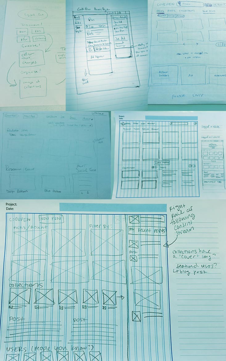
We began the project with a thorough research phase to gain a complete understanding of CodePen. There are so many power-user features we weren't even aware of, and it is quite a robust product that we needed to gain perspective on. As we both work in the same industry and many of CodePen's users are our peers, we wanted to make sure we included as much input from the community as we could. We knew we had to dig deep in research.

Stakeholder Interviews

It was important to include stakeholder input, so we knew where to focus our efforts and discussions when we talked to users. The very first thing we did was just get to know the guys at CodePen a little better. We sat down with them (well, we sat down at our respective monitors) to see what they were hoping to get out of our engagement. This helped us to not only know where their heads were at for their future, but it also showed us quite varied perspectives on what CodePen means to them.

We used Google Hangouts to talk with the team (a free and easy way to talk with anyone face-to-face).

When talking to the three of them, there were definitely some common themes emerging. This was exactly what we were after—a jumping off point. Knowing their priorities directly influenced the scripts we used in our user interviews.

Here are some of their takeaways when asked what would make this project successful:

  • Tim: Important people in community expressing positivity about the site. Having a design language.
  • Chris: A design we’re excited about. Users associating CodePen with good design/UX.
  • Alex: If it becomes more valuable to put your work on CodePen because it is highly visible—resulting in users finding better work/becoming more influential. Increasing social interaction and participation in the community.

User Research

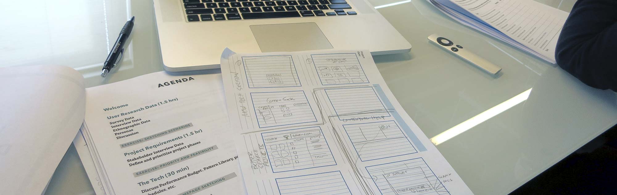
To get the most out of user research, we needed to first carefully plan exactly what we hoped to get out of it. We knew we wanted to get _some_ opinions and feedback about the product, but individual interviews weren't the place for that. We decided we needed to set very specific goals and purposes for three different kinds of research: user survey, user interview, and ethnographic observations.

  1. User Survey

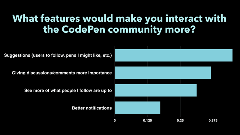
    For feedback, we knew the numbers were our biggest asset, so we sent out a survey so that we could pull common themes from 500 people, instead of specific cases from just one person. The only caveat that we kept in mind was the proportion of Pro users who responded to the survey was higher than site average, so we considered the feedback to be more from that user base.

    View the SurveyView the Results

  2. User Interviews

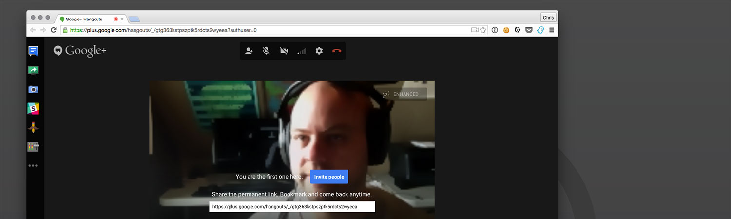
    For our one-on-one interviews, we prepared a script of questions based on three main types of users (browsers, creators, and teachers). We interviewed 10 users from all over the world. Each interview was 15-20 minutes, conducted over Skype or Google Hangouts. Our user interviews were mostly to get to know the actual people, so we could learn how CodePen fits into their lives. We tried to steer these conversations away from specific feedback and more about their current usage. This created a sense of empathy for us, and left an impression on us as we moved into design decisions.

    Here's an example interview:

    Interview with Nick Hehr on February 18, 2015
  3. Ethnographic Observation

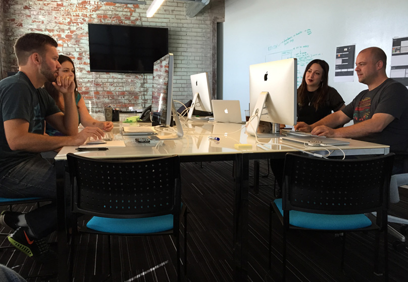
    We also knew we wanted to see CodePen in action. There's so much nuance to the interface, we wanted to get a holistic understanding of what our users actually do on the site. We knew we had to observe people (outside of Sparkbox) using it. We met with a few local users to actually watch them use CodePen. This type of research was intended for us to watch for weird workarounds for certain tasks.

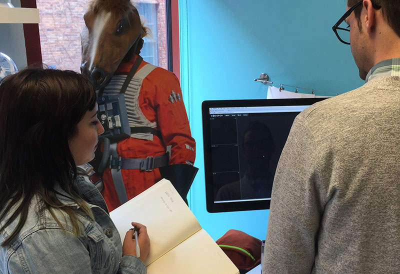
    We also saw what kind of weird stuff might happen around our users.

    Being in the users’ own environments took our insight to new levels of understanding and helped us identify user experience issues we may have missed without this type of hands-on research.

    These controls were hidden by this users second monitor.

March 2015

We gathered the information we needed to get and felt good about the themes we extracted from our research. We got everyone together to have a kickoff meeting to discuss our findings and prioritize our efforts. We set out to leave the kickoff meeting being equipped to hit the ground running (or rather, designing). Everything we gathered up until this point hadn't been shared with CodePen, so we created an agenda that let us explain everything and our recommendations moving forward.

We knew it was important to have the kickoff not just be us talking at the CodePen crew, so we came up with several design exercises to break up the day and allow everyone to have a say in what we designed. We spent a lot of time discussing all of our findings (and what surprised them) and talked about what was important and where to focus. The last bit of the day was spent with everyone sketching their ideal homepage, after knowing what all we knew now about our users.

We created user personas that represented typical CodePen users that emerged from our research. Each user was a fully fleshed out person complete with a backstory, job, needs, and typical behaviors. Here's a taste of some of them:

PERSONA 1: Trey Watson

The Connected Helper

Job Title: Freelance developer + college teacher
Location: Leeds, England

"It would be nice if it was more of a social network, rather than just faceless pens."

Trey is a freelance developer who also teaches. He’s very connected both in his hometown and across the internet. He loves to help people, whether they’re students in his classroom or strangers on the internet.

PERSONA 2: Emma Mason

The Boundary Pusher

Job Title: Full Stack Developer
Location: Boston, MA

"Halt new features and fine tune everything that’s there. Get that solid—you’re already light years ahead of the competition."

Emma is a full stack developer on a product team in Boston. She wears many hats at her job, covering frontend design thinking to backend integration. She uses CodePen frequently both at work and at home.

Everyone got a packet, which contained the day's agenda and kept everyone on track.

Some of the most interesting sketch results came from an excercise where we had everyone sketch out an idea for the homepage. No holds barred.

Lots of interesting ideas came up during sketching. Those of us who tend to be more conservative with ideas were coming up with very out-there ideas and vice versa. The ideas were really flowing—proof this was a very worthwhile excercise. Even as we've moved forward with the design process, these sketches are referenced.

After our kickoff meeting, we planned how to best begin tackling the design challenges. So much of CodePen is intertwined with other aspects of CodePen, so figuring out ways to break up our efforts while still being cognizant of the relationships between features was important.

Wireframes

While we typically don't like to start with a homepage on a redesign, we felt that CodePen was a unique instance where it actually would provide a lot of patterns used throughout the rest of the site. We took ideas from all of the kickoff sketches and began to wireframe using Sketch + Invision. We created a clickable prototype to show different interactions we were thinking could be used on the homepage.

Element Collage

Simultaneously, while working on the wireframes, we also explored an element collage. Typically, we might try a couple different directions in an element collage to see what ideas stick. But CodePen's brand had enough good parts to keep that we didn't feel we had to reinvent the wheel. Instead, we opted to explore a natural evolution of the brand and site. The last thing we want is the redesign to be alienating to the existing users.

April 2015

After reviewing both the element collage and the homepage wireframe, CodePen was happy with the direction we were headed. The next natural progression was to combine the two and account for the feedback there. Since we have a nice relationship with CodePen, it's been really nice to quickly drop ideas in Slack while we're in progress. We just keep pushing forward until they tell us we're off. Placing deliverables on less of a pedestal meant we didn't design in circles for fear of what the client would say.

We have a combined homepage started and are currently in the process of finalizing the home page and other key templates before moving onto the Editor.

CodePen / Sparkbox Party at Converge SE

Once we had the initial homepage design done, it was time for our Converge SE party. We all had a blast, met tons of great people, and it was the first time that the entire team got to meet and hang out together.

We came back from Converge energized and ready to focus on knocking out a few more key pages for the first phase. We explored different typographic treatments and played around with the layout of the homepage some more.

CodePen Sparkbox Party at Converge SE
CodePen / Sparkbox party at Converge SE

May 2015

To explore how the system would begin to work together outside of the established homepage styles, we moved onto the Pens page—which will be a new addition as the main hub for exploring Pens. Since Pens are central to CodePen, we wanted to make sure that we nailed the styles and layout of that page to help inform the other pages. From there, we continued iterating on our typography explorations. We started working on all accompanying Post pages, as those will cover a lot of ground for our typographic system.

Font Explorations:

CodePen Pens Page
New Pens Page

Moving To The Browser

We’re currently moving out of Photoshop and into the browser to continue refining decisions there. We have hit a point where most of the current patterns are designed, and we need to see how things are looking in-browser and begin testing them.

June

Some design and development happened in June, but it was a slow month. Hey, it's summer. Large projects by small teams almost certainly have down time like this.

July

The four delivered designs were chosen not only because they were important pages, but because they were quite different and had comprehensive coverage of the patterns used throughout the site. Now that these patterns were established, moving forward in development meant applying them all over the application, which takes time. So Team CodePen set out to work on development of the delivered designs.

"Before" Screenshot Inventory

One task we wanted to make sure we did before we got too far was to take a complete inventory of screenshots of the entire app. These not only served as good "before" shots (and certainly some future nostalgia), but ensured that we were looking at and considering all pages of the app.

UI Screenshots July 2015

Style Guide

Early in the design stages, CodePen created a style guide to help ensure the components that build the site had some consistency and could be looked at and discussed as a whole. Also, as we moved forward with the process, we could check in on the style guide and make sure that all the components were considered and consistent.

We saved a screenshot of the old style guide, and below is an image of how it has evolved. There was a lot of simplification, like a reduction in the number of colors used, reduction of different button styles, and reduction of icons in use. The design itself could be considered a simplification, so it's good that the guide reflected that.

New Styleguide Progress

August

The new design wasn't purely aesthetic—it involved some backend work as well. As an example, there was a new primary page for people exploring content on CodePen to browse Posts. This was a brand new page that never existed before on CodePen:

The "Explore Posts" Page

This was a fairly simple page relative to the rest of CodePen, but there was a lot to consider in how design and development landed. We needed to think through:

  • The creation of a new URL. /posts/ didn't exist before, so we needed to create it and consider the ramifications of that (thankfully there was no user named "posts"!).
  • How to get all the data needed to make this page possible. There were brand new concepts here—browsing Posts by Picked/Popular/Following wasn't possible before, so this was brand new code.
  • How to implement the new design patterns in a reusable (hopefully literally the same code used on the homepage and elsewhere to display a Post) and adaptable (note the "big" featured post) way.
  • How to ensure the design system holds up (colors, typography, icons, etc).
  • How to ensure the functionality all works. Can I heart a Post here? Can I not heart my own Posts, as intended? Can I paginate? Does the correct area paginate?

There was a lot to design, develop, and test on every page. And at this point, every single page of the CodePen site had been touched and needed to be reviewed and considered when finessing the design into place. Many pages involved new functionality as well. For example, there is now the ability to follow a user on a page which you couldn't do before. Much like visual design, the code design required creating reusable patterns.

September

With the first major round of development finished, it was time again to do some back-and-forth design with the intent of cleaning things up and putting the polish on the final design. We decided the best way to bridge the final design gaps would be to do in-person pairing. We were luckily able to pair together at the Sparkbox offices for a week to collaborate and test our designs in the browser.

CodePen and Sparkbox pairing
Design pairing at the Sparkbox offices

Additionally, we're going to be releasing a series of four recorded podcasts over the coming months where we talk about our design process. As they are released, they can be found on the CodePen Radio blog as well as on this microsite. You can see the first two here:

Podcast 1: Origin Story

Podcast 2: User Research

October

Launching a site into the universe is only one blip on the long, iterative adventure that is building a website, and this moment really shines when designing in the open. Now that we are clearing some of the dust from building and changing the previous design, we’re ready to improve upon all of our theories and ideas we had in the early stages. And that’s where you come in.

First Phase of the Redesign

Today we’re excited to present to you, the community, the first phase of the CodePen redesign. By first phase, we mean we’ve made some major adjustments, but there’s still plenty left to do. Instead of going away for months and months, perfecting every detail, we figured we’d stay in the spirit of being open and show you where we are. The best way for us to truly improve upon the CodePen experience for CodePen users is to, well, listen to the CodePen community.

CodePen Redesign
Screenshot of the redesign

Participate and Share Your Feedback

There’s still some pages that might have some legacy layouts and interface, and that’s okay (after all, it’s a big product!). There’s still some user testing and UX work to be done, and that’s okay too. We’re going to continue refining CodePen until it’s where we (including you, a CodePen user) feels that it’s in a really great place. So, instead of thinking of this launch as the end of this effort, let’s think of it as the beginning of designing a better CodePen together. So, feel free to participate and share your feedback on Twitter or even add issues to the public GitHub repo.

Also, we have release podcast number three in our relaunch series. Listen below to hear us talk about preparing for the final steps before this first launch.

Podcast 3: Preparing for Launch